
Expolica Ceramics
Expolica Ceramics is a clay export company with full control over its supply chain - from owning and operating its own mines to processing and exporting various types of industrial clays. With a strong focus on quality, traceability, and scale, Expolica works closely with manufacturers and industries around the world, supplying raw material that is both consistent and responsibly sourced. Their approach combines technical precision with a deep understanding of the material at its origin.
When Expolica Ceramics approached Wafotu for a complete brand overhaul, the goal was to create an identity that felt modern, industrial, and grounded in the nature of their work.
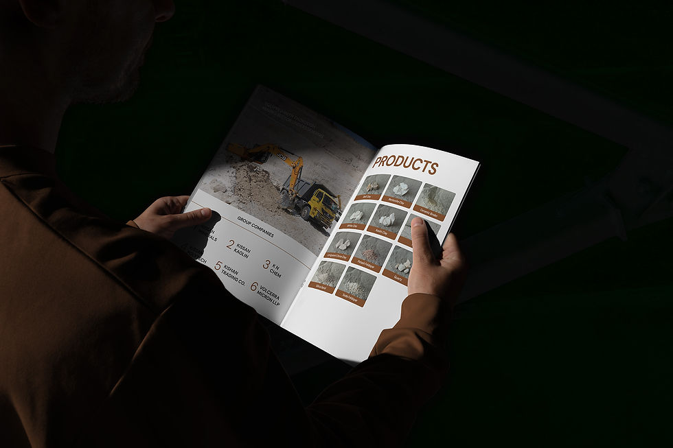
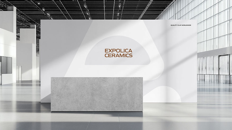
The logo is built from a triangular form representing a clay mountain, with a lowercase ‘e’ subtly formed within it, tying it back to the brand name. A hollow circle at the centre symbolises mine extraction, making the mark meaningful and distinct. The symbol is paired with a bold and wide word mark for strong visibility, and a cohesive, colour palette inspired by earth and mineral tones. Photography and imagery is also done by Wafotu ensuring visual consistency across all brand touch points, from packaging to digital.


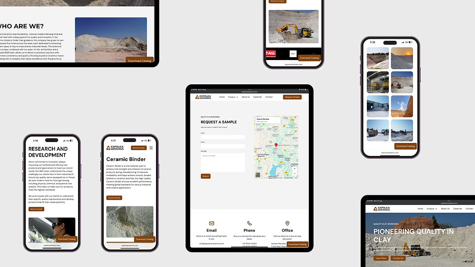
The website for Expolica Ceramics was designed to reflect the brand’s modern industrial identity while keeping navigation clean and functional. Large, high-quality product photography showcases the different types of clays with consistency and detail, while the earth-toned colour palette ties the digital experience to the brand’s core materials.
Strong typography, spacious layouts, and clear information hierarchy make the site both visually striking and easy to use for global clients. The result is a digital platform that communicates professionalism, product quality, and brand coherence.


[ MORE PROJECTS ]
Beauty & Wellness

Fashion & Apparel

Manufacturing & Industries

